plot(ToothGrowth$len)
The plot function is the most basic function for plotting continuous data. If we use plot on one variable, the values of the variable will be plotted against their index, i.e., the order of the data within the object they’re stored:
plot(ToothGrowth$len)
With two variables plot puts the first variable on the x-axis and the second variable on the y-axis (y versus x):
plot(ToothGrowth$dose, ToothGrowth$len)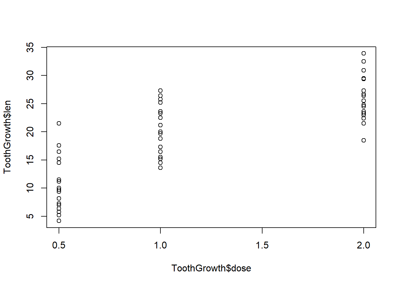
Many parameters are available for customizing your plot. See ?par for an extensive list. We will just look at a couple here, like changing the axis labels:
plot(ToothGrowth$dose, ToothGrowth$len, xlab = "Dose", ylab = "Tooth Length")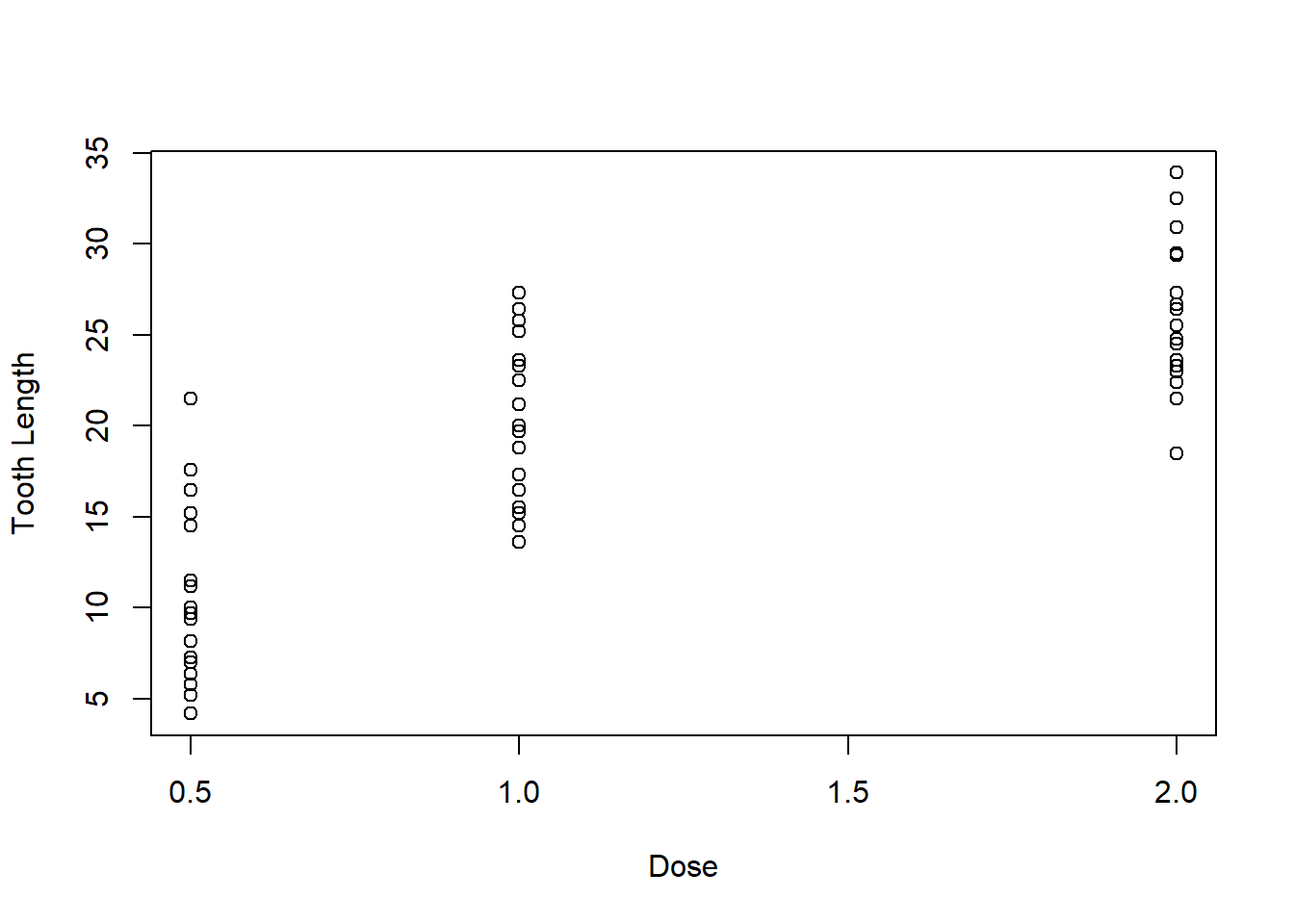
We can also add a title:
plot(ToothGrowth$dose, ToothGrowth$len, xlab = "Dose", ylab = "Tooth Length", main = "Guinea Pig Tooth Growth by Dosage")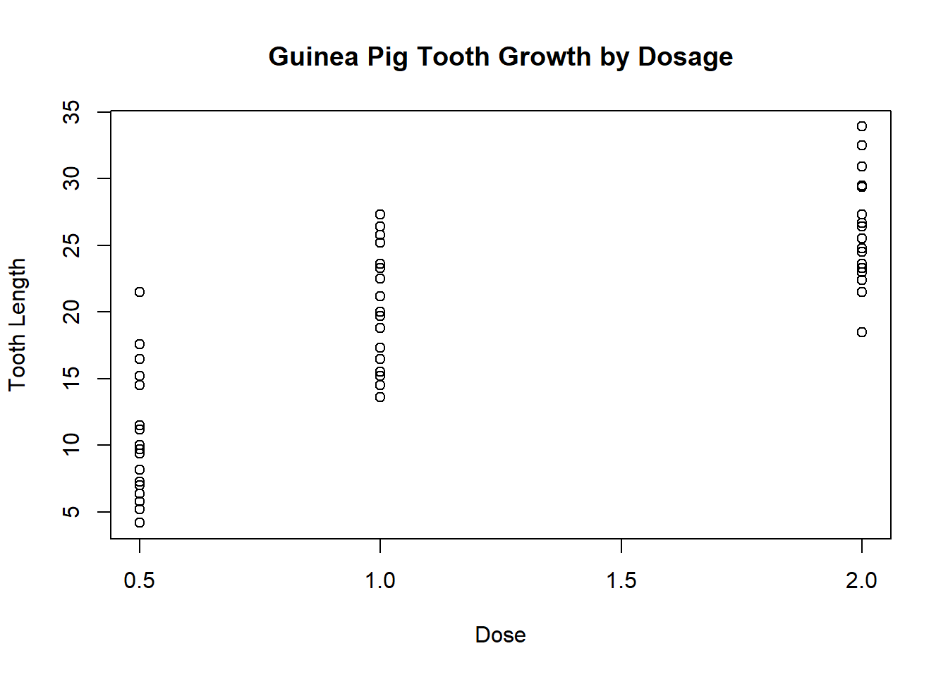
and even change the colors and characters of specific points:
plot(ToothGrowth$dose,
     ToothGrowth$len,
     xlab = "Dose",
     ylab = "Tooth Length",
     main = "Guinea Pig Tooth Growth by Dosage",
     col = ToothGrowth$supp,
     pch = as.numeric(ToothGrowth$supp))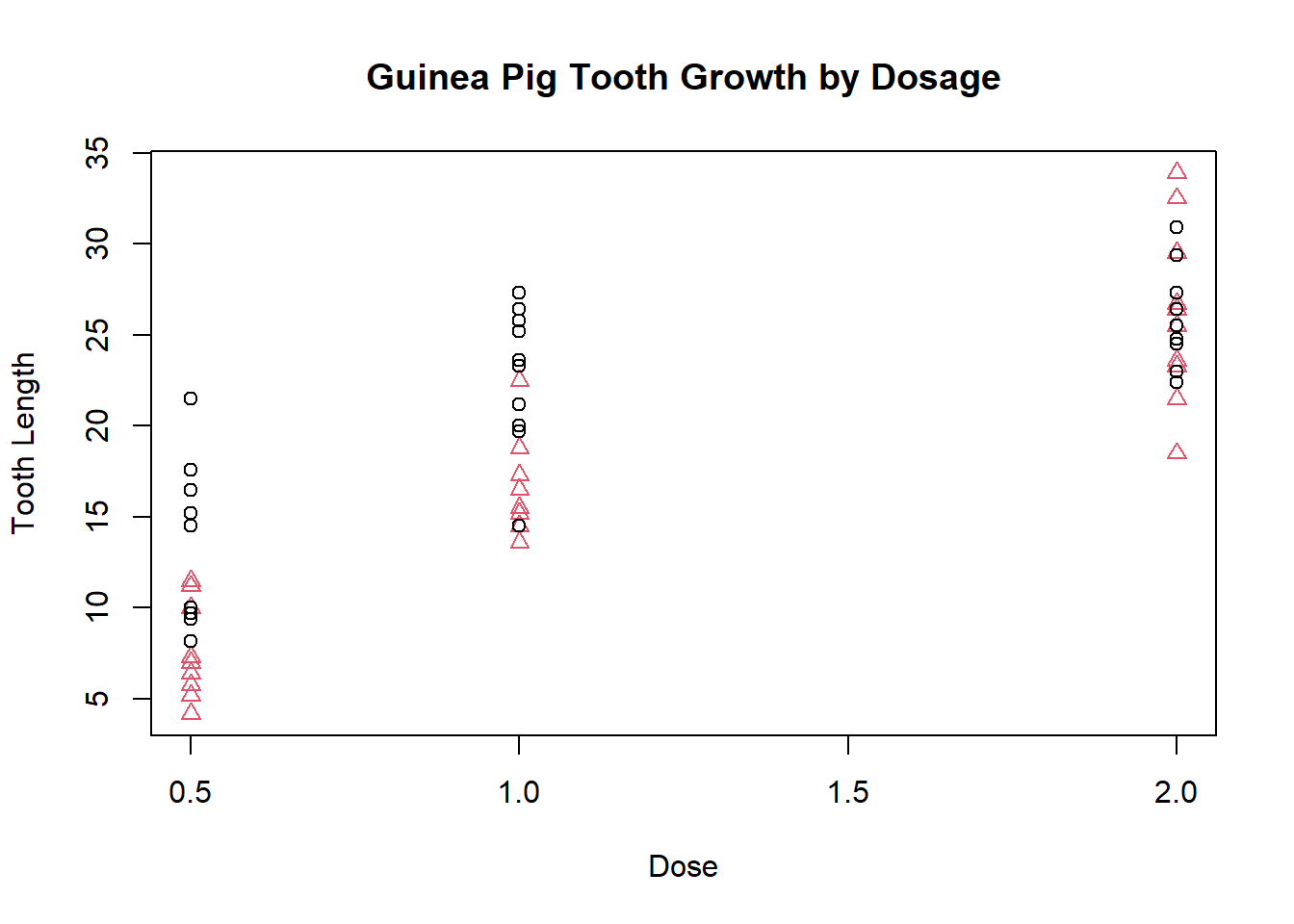
The legend function adds a legend so we can easily identify which points represent which groups:
plot(ToothGrowth$dose, ToothGrowth$len, xlab = "Dose", ylab = "Tooth Length", main = "Guinea Pig Tooth Growth by Dosage", col = ToothGrowth$supp, pch = as.numeric(ToothGrowth$supp))

legend(1.5, 15, c("OJ", "VC"), col = 1:2, pch = 1:2)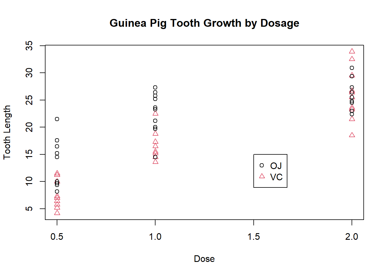
The location of the legend can also be specified by stating a region of the plot e.g. “bottomright” to place it in the very bottom righthand corner of the plot.
The argument cex stands for “character expansion” and will enlarge the size of points:
plot(ToothGrowth$dose, ToothGrowth$len, xlab = "Dose",
     ylab = "Tooth Length", main = "Guinea Pig Tooth Growth by Dosage",
     col = ToothGrowth$supp, pch = as.numeric(ToothGrowth$supp),
     cex = 2)

legend(1.5, 15, c("OJ", "VC"), col = 1:2, pch = as.numeric(ToothGrowth$supp), cex=2)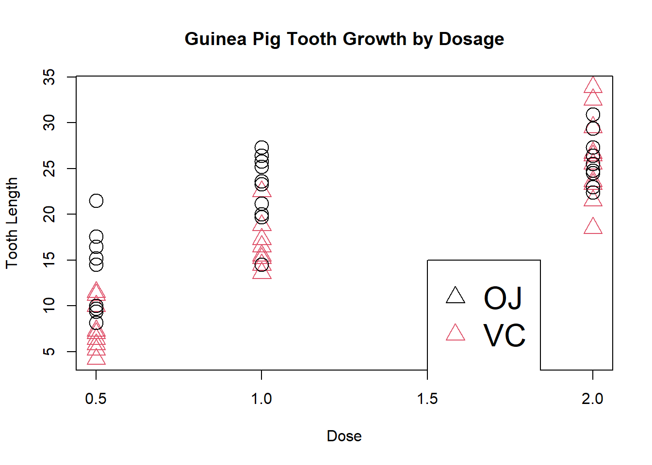
To create a plot using lines instead of points, we can actually still use plot, but we need to specify the type of plot we want, e.g.:
plot(ToothGrowth$len, type = "l") # note type is the letter l for "line"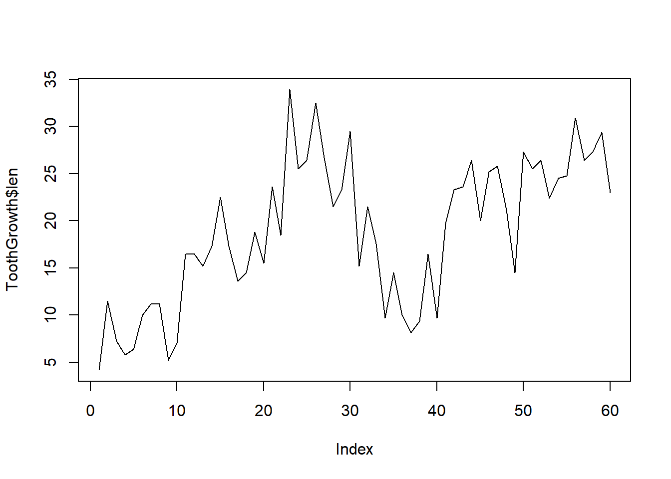
plot(ToothGrowth$len, type = "b") # note type is the letter b for "both"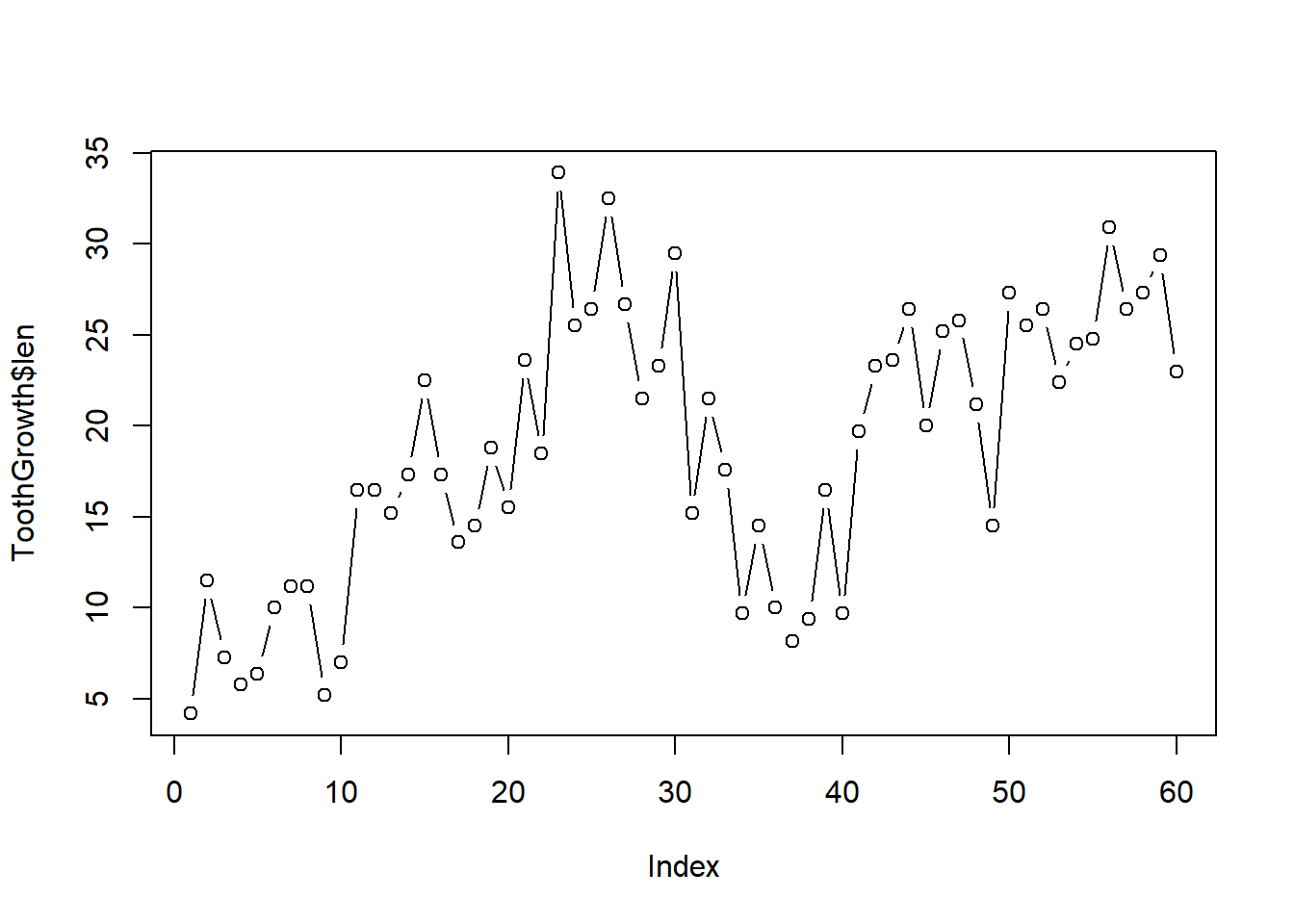
We can add additional lines by calling lines:
plot(ToothGrowth$len, type = "l")
lines(ToothGrowth$len + 2)
The line type, width, and color can be adjusted as follows:
plot(ToothGrowth$len, type = "l")
lines(ToothGrowth$len + 2, lty = 3, lwd = 3, col = "darkgreen")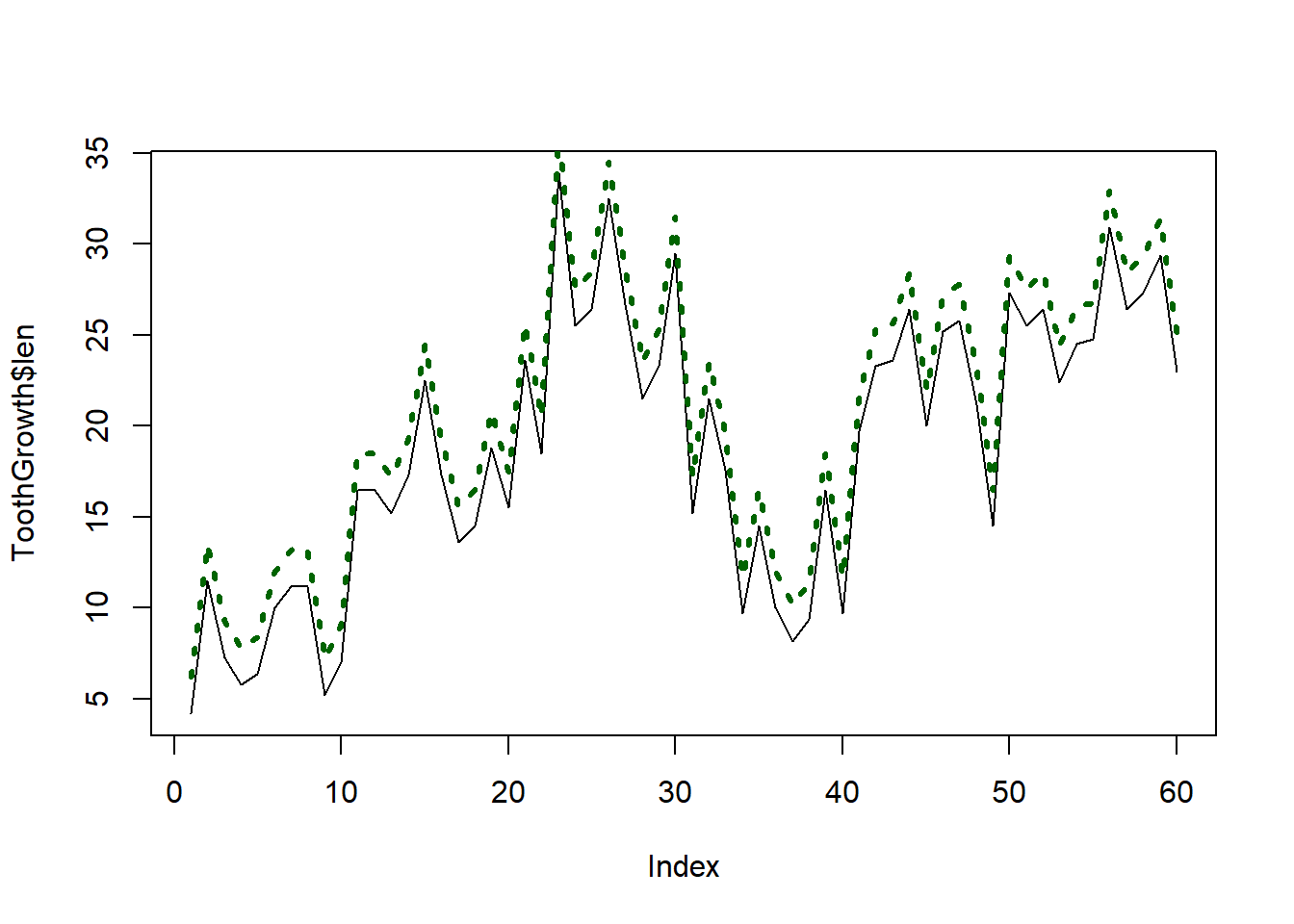
Viewing categorical data in a scatterplot often doesn’t make sense. For example, if we want to see the number of guinea pigs who received each dosage, the following doesn’t provide this information in the most intuitive format:
plot(ToothGrowth$dose)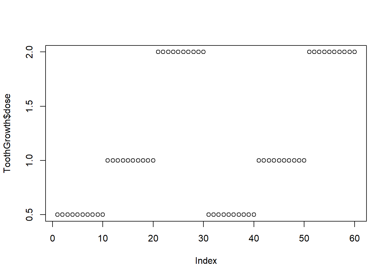
table(ToothGrowth$dose)
0.5   1   2
20 20 20 barplot(table(ToothGrowth$dose))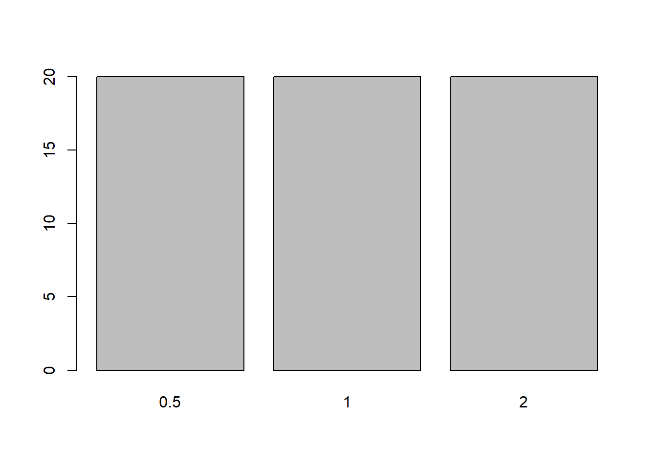
We can plot proportions instead of frequencies, as is often helpful (though not in this case):
props <- table(ToothGrowth$dose)/nrow(ToothGrowth)
props
      0.5         1         2
0.3333333 0.3333333 0.3333333 barplot(props)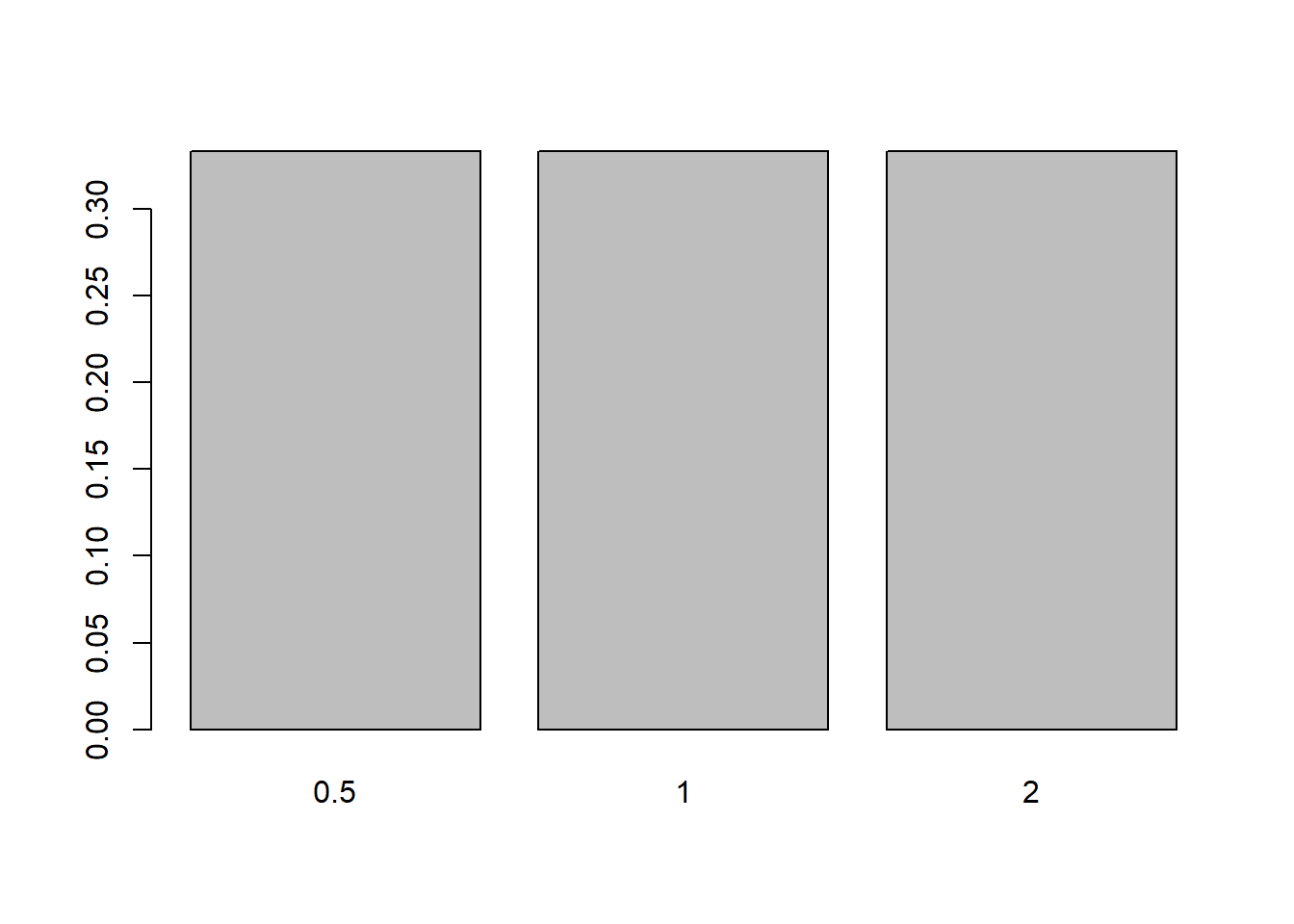
Note that the y-axis doesn’t quite extend to the height of the bars. The range of the y-axis is easily change in plots by adjusting the parameter ylim (similarly xlim for the x-axis):
barplot(props, ylim = c(0, .4))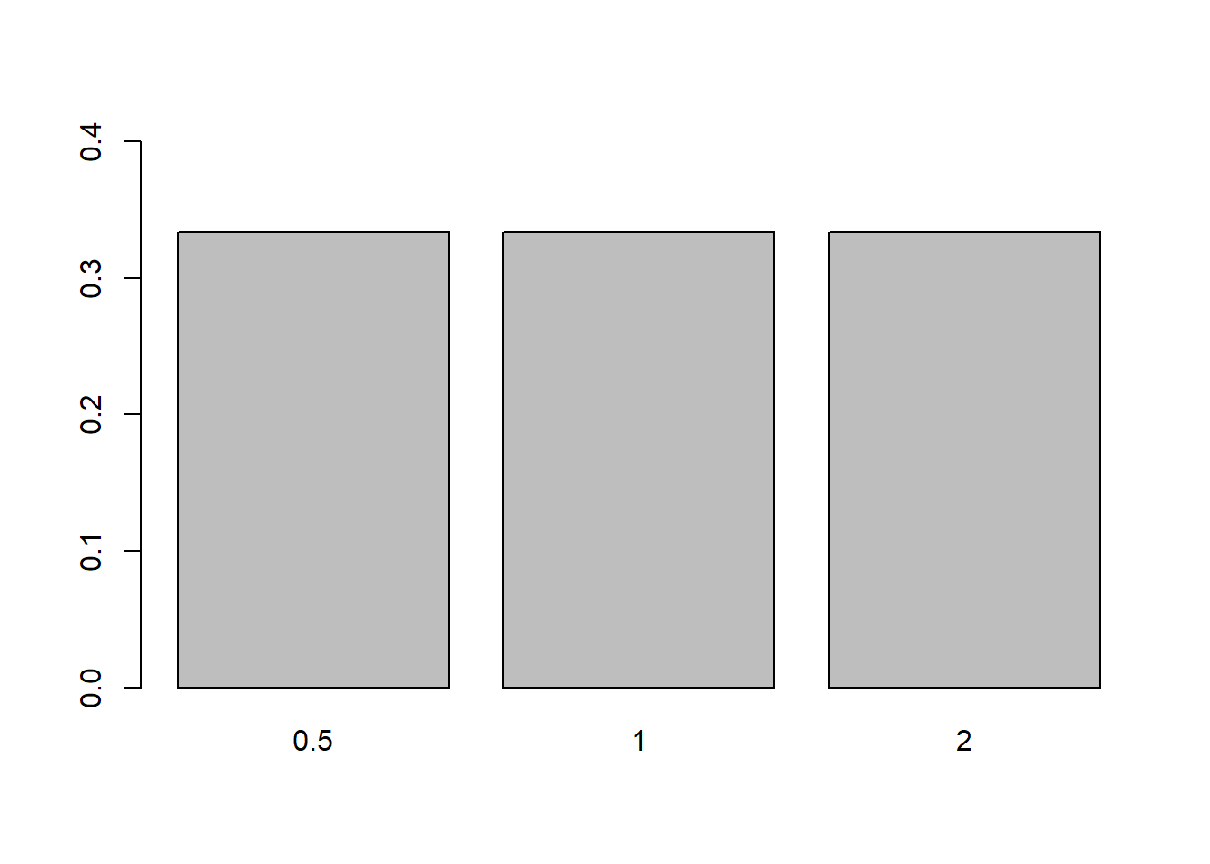
Yet again, there are many parameters available for customizing the plot. Let’s try changing the width and colors of the bars:
barplot(props, ylim = c(0, .4), width = .2, col = c("blue", "white", "red"))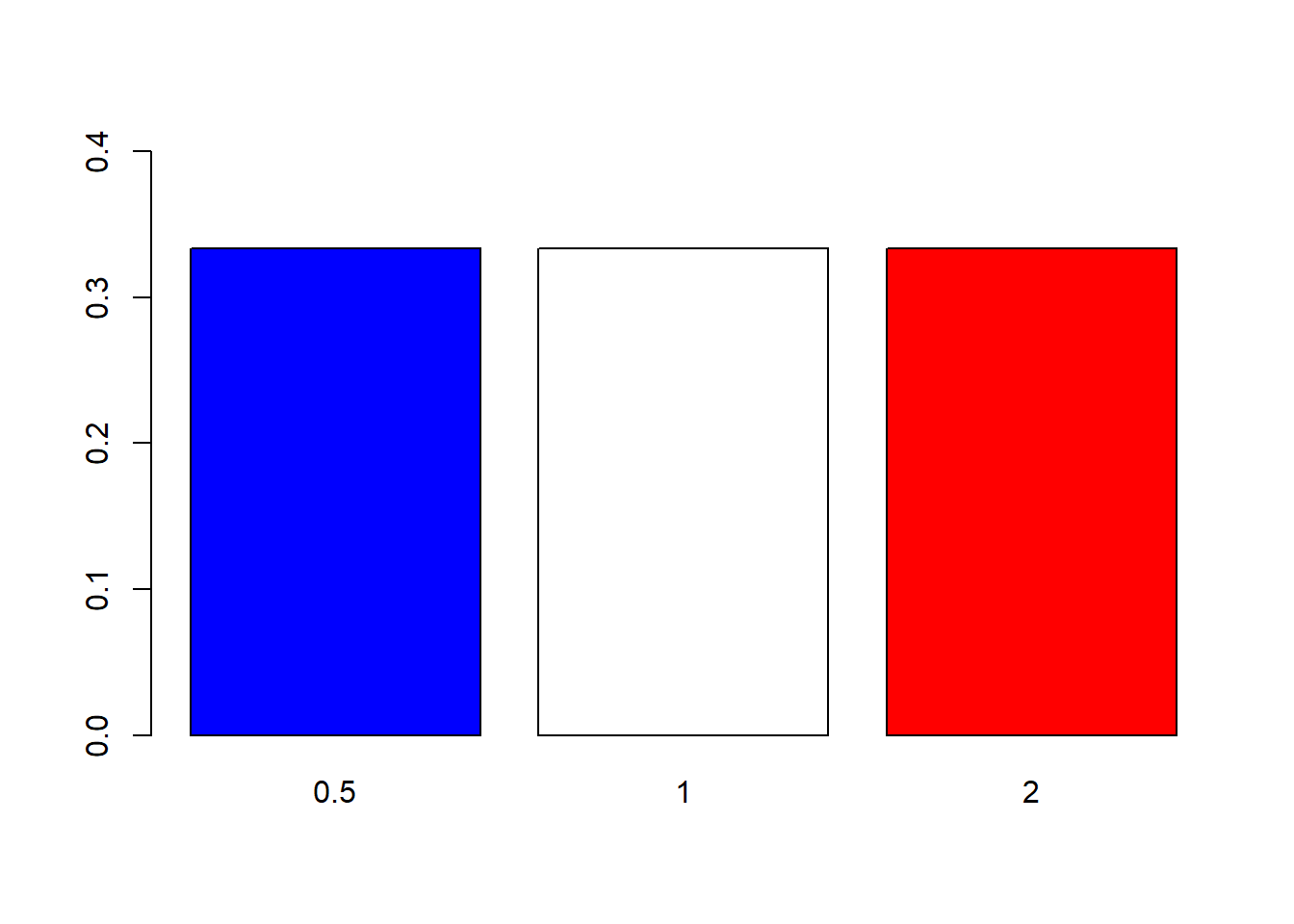
And we can plot the bars horizontally, if preferable:
barplot(props, xlim = c(0, .4),
  width = .2, col = c("blue", "white", "red"),
  horiz = TRUE)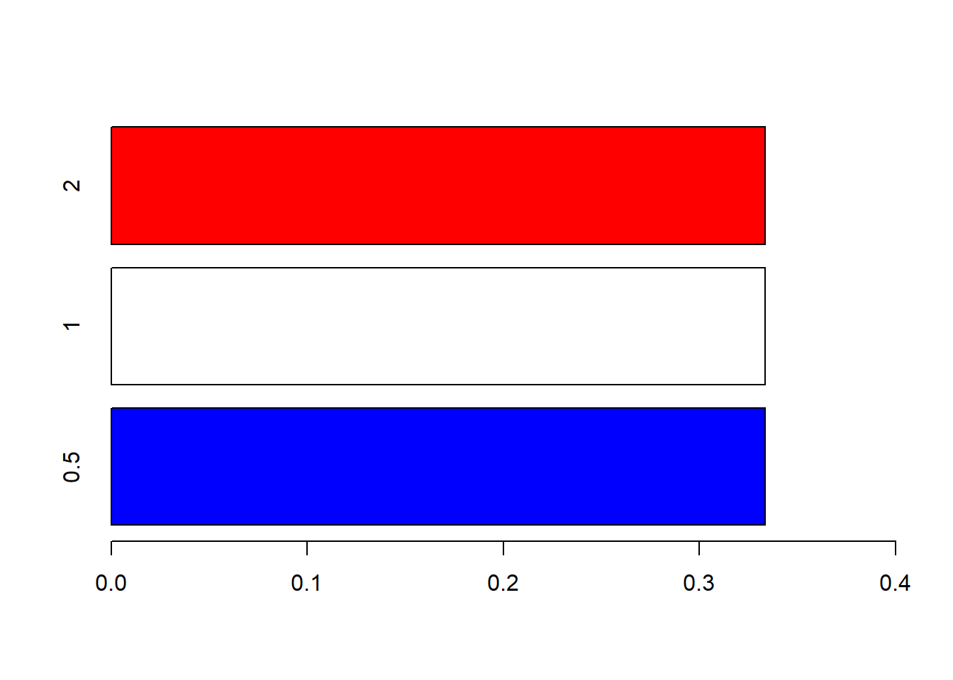
Note that we adjusted the range of the x-axis now instead of the y-axis.
A bar chart is slightly different from a histogram. We use bar charts to plot frequencies (or proportions) of values present in categories. Continuous data don’t have categories, so to make a similar plot we have to create “categories”. They are often called bins or cells and are created by delining ranges in which the frequencies are calculated. Thankfully, R will do this, and plot the histogram, when we call the function hist:
hist(ToothGrowth$len)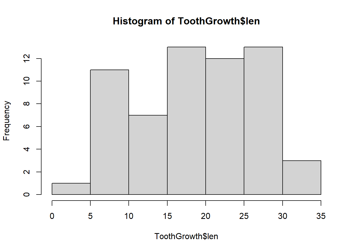
Note that in a histogram the sides of the cells touch, whereas they do not in a bar chart. We can also plot the proportions, now called “density”, by changing a single parameter:
hist(ToothGrowth$len, freq = FALSE)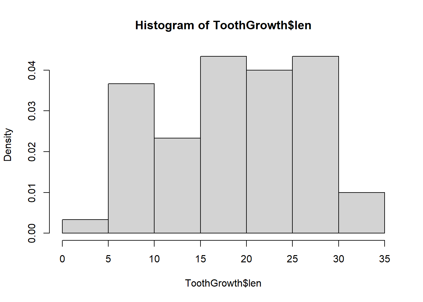
In the next graph we plot the histogram with a different bin width by specifying where to make the breakpoints between the bars:
hist(ToothGrowth$len, freq = FALSE, breaks = seq(0, 35, 2))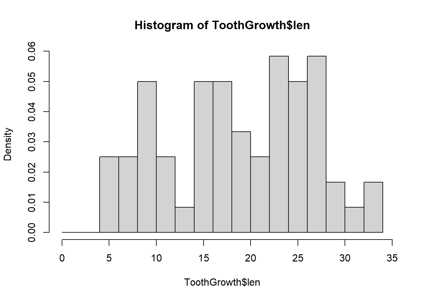
Note how the granularity of the plot changes with the width of the bin. We can also change the breaks by delining the number of cells to use:
hist(ToothGrowth$len, freq = FALSE, breaks = 25)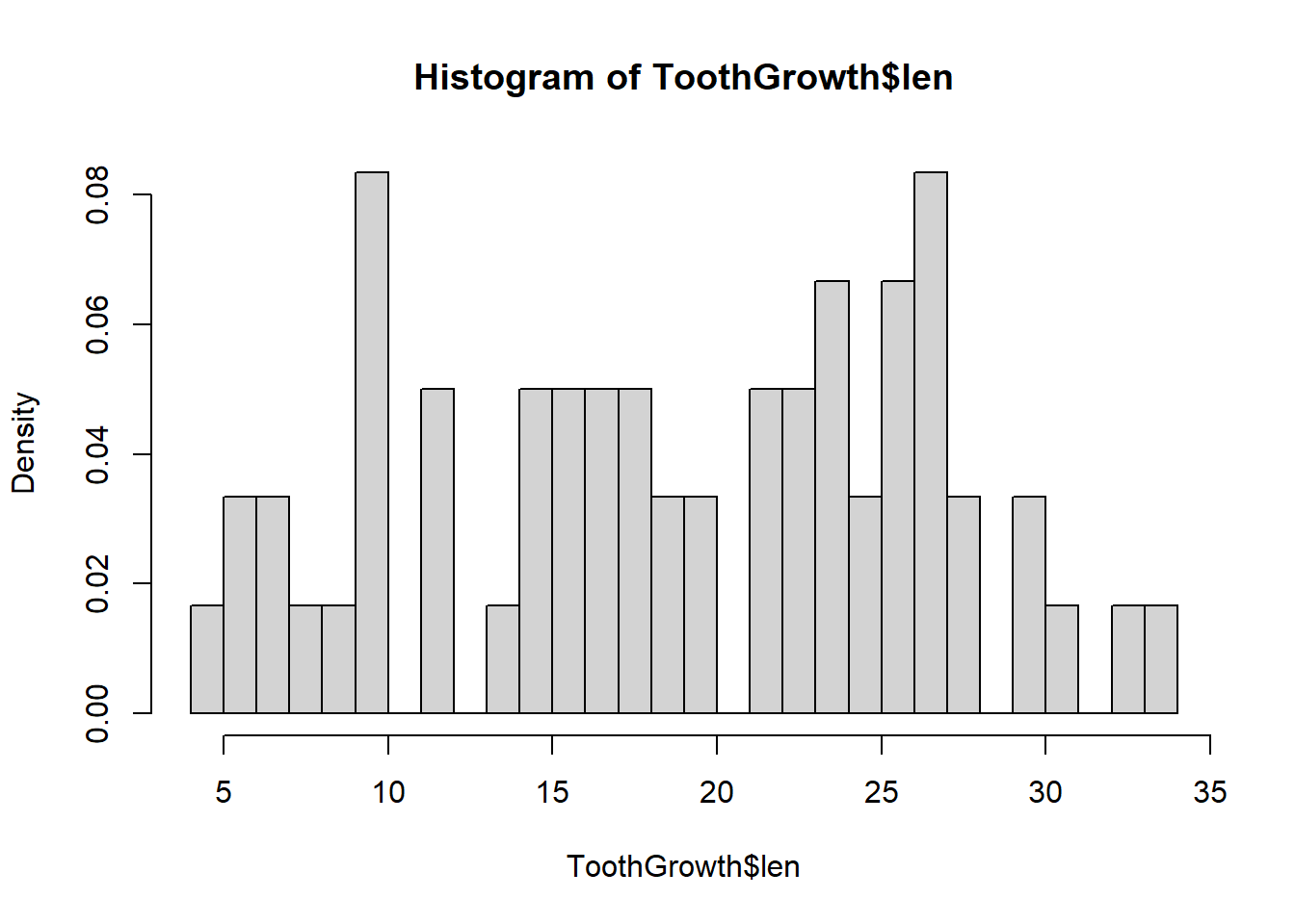
The same parameters that change the axes and labels are applicable here:
hist(ToothGrowth$len, freq = FALSE, breaks = seq(0, 35, 2),
  main = "Histogram of Tooth Growth", xlab = "Tooth Length",
  ylim = c(0, .07), col = "orange")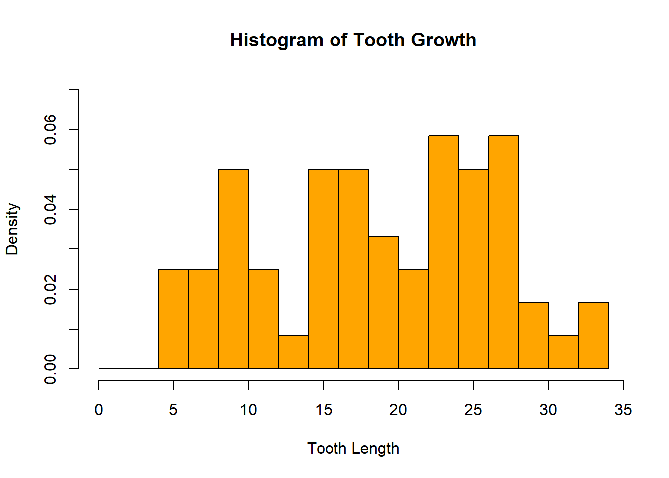
A boxplot is another graph we use to view the distribution of a continuous variable. It displays the specified quantiles of the data in the following way:
boxplot(ToothGrowth$len)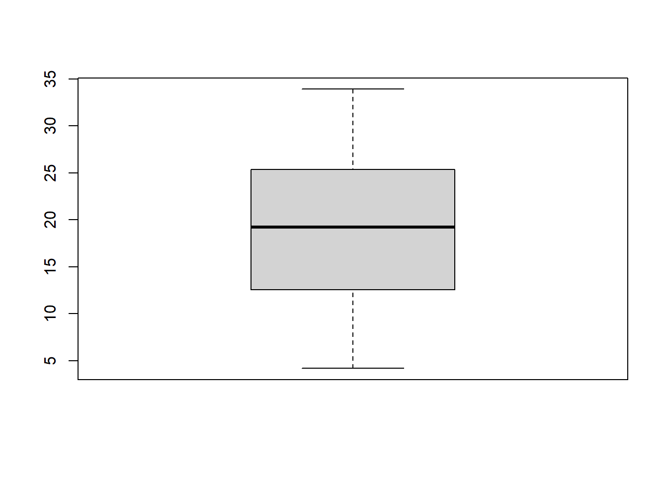
A single boxplot is nice for visualizing the distribution of one variable, but plotting several side by side allows for a simultaneous comparison of distributions. Here we will use the formula notation. The format y ~ x, where y is a numeric vector and x is a factor, tells the boxplot function that we want to separate the continuous y values into as many boxplots as there are levels of the factor x.
boxplot(ToothGrowth$len~ToothGrowth$supp)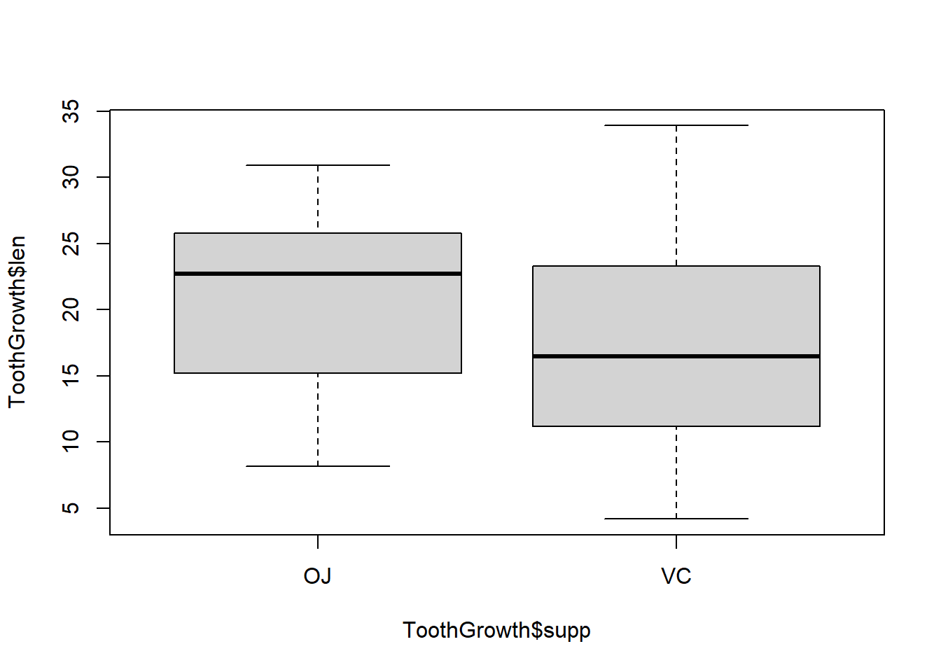
Just like in the bar chart, we can plot the boxes horizontally and change the colors, labels and axes:
boxplot(ToothGrowth$len~ToothGrowth$supp,
  col = c("darkgreen", "purple"),
  ylab = "Supplement Type", xlab = "Tooth Length",
  ylim = c(0, 40), horizontal = TRUE)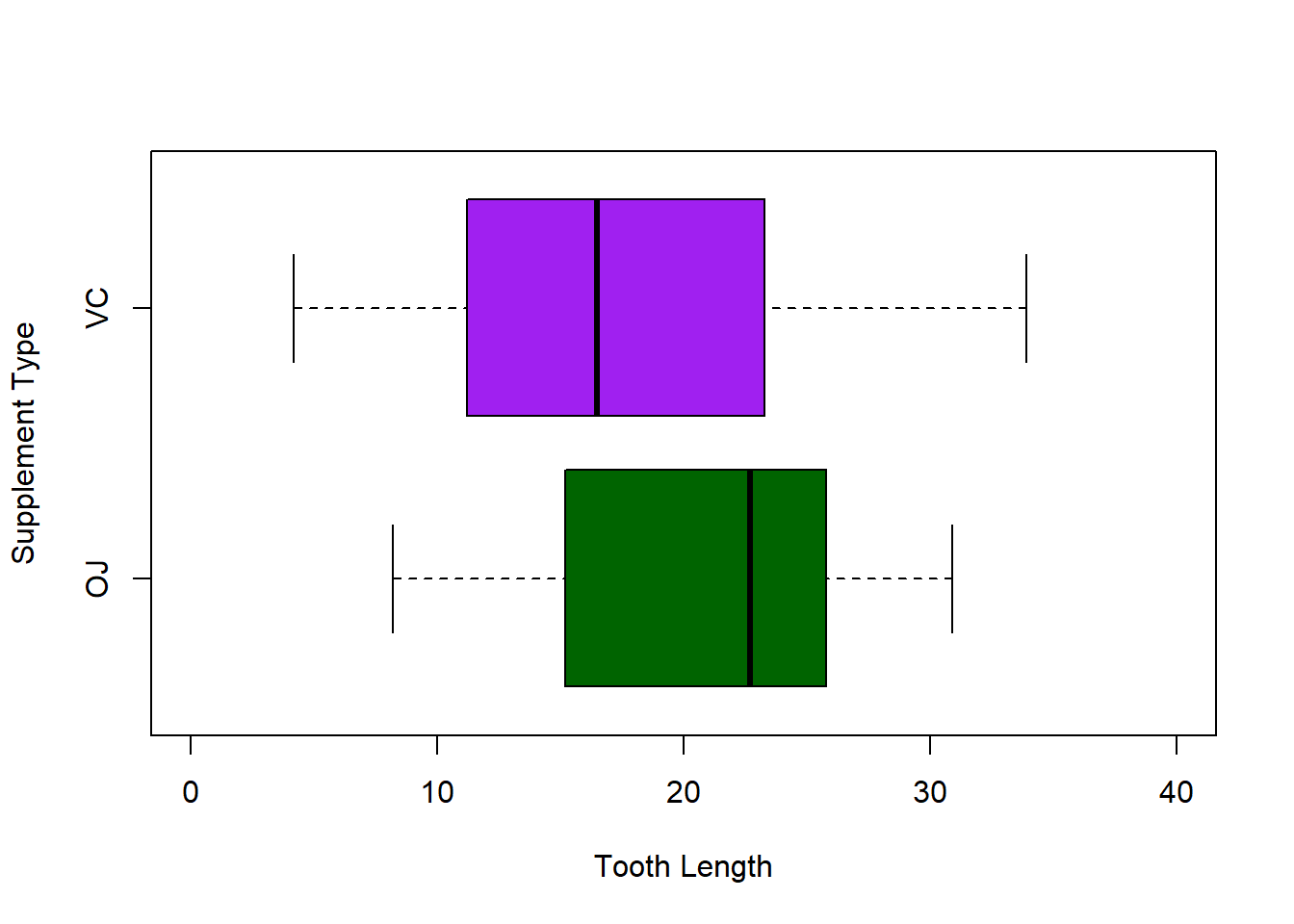
The settings of the parameters of a plot, including the margins, can be specified by calling par() before creating a plot. One nice setting we’ll introduce here is how to put multiple plots into one graphics device:
par(mfrow = c(1, 2))
  boxplot(ToothGrowth$len~ToothGrowth$supp, main = "Boxplot",
  xlab = "Supplement Type")

hist(ToothGrowth$len, main = "Histogram", xlab = "Tooth Length")
The settings will stay fixed until we close the device (e.g. by calling dev.off()) or reset par (e.g. par(mfrow = c(1, 1))). It is highly recommended to get familiar with the help page for par to control graphing parameters to create custom graphs. Another helpful function is axis, which allows the specification of custom axis labels (e.g. where to put them and at what angle). See ?axis for more information.
Up until now we have been creating graphs in a single graphics window that gets overwritten every time we create new plots. If we want to save the images created, we can use “Export” in RStudio to specify what type of file we want to write, its size, location, and name.
Alternatively we can use functions such as png, pdf, and jpeg. Since we can save our code and not our mouse clicks, the use of these functions avoids any confusion about how an image was written, allows for quick simple changes, and provides a convenient way to reproduce multiple, similar plots. For example:
# note: run getwd() to see the working directory -
# that is the directory to which files will be written
pdf("plot1.pdf", width = 6, height = 9)
boxplot(ToothGrowth$len~ToothGrowth$supp,
  col = c("darkgreen", "purple"),
  xlab = "Supplement Type", ylab = "Tooth Length",
  ylim = c(0, 40), horizontal = TRUE)
dev.off()

pdf("plot2.pdf", width = 4, height = 8)
boxplot(ToothGrowth$len~ToothGrowth$supp,
  col = c("darkgreen", "purple"),
  xlab = "Supplement Type", ylab = "Tooth Length",
  ylim = c(0, 40), horizontal = TRUE)
dev.off()
Note that you have to call dev.off() to finish writing the image to the file. If more than one device is open, the return of that function will display a number larger than 1.
The units for the width and height arguments of pdf are in inches (7 by 7), but the default for e.g. png is pixels (there is an argument units to change it to in, cm, or mm):
png("plot1.png", units = "in", res = 300,
  width = 6, height = 9)

boxplot(ToothGrowth$len~ToothGrowth$supp,
  col = c("darkgreen", "purple"),
  xlab = "Supplement Type", ylab = "Tooth Length",
  ylim = c(0, 40), horizontal = TRUE)

dev.off()