BOD Time demand
1 1 8.3
2 2 10.3
3 3 19.0
4 4 16.0
5 5 15.6
6 7 19.8Make sure that you try the exercises yourself first before looking at the answers
Use R to do the following exercises on the BOD data
Display the built-in dataset called BOD by running BOD.
BOD Time demand
1 1 8.3
2 2 10.3
3 3 19.0
4 4 16.0
5 5 15.6
6 7 19.8What is the data structure of BOD? What are the dimensions?
str(BOD)'data.frame': 6 obs. of 2 variables:
$ Time : num 1 2 3 4 5 7
$ demand: num 8.3 10.3 19 16 15.6 19.8
- attr(*, "reference")= chr "A1.4, p. 270"dim(BOD)[1] 6 2What are the names of BOD? Use a function other than str.
names(BOD)[1] "Time" "demand"Make a line graph of demand versus time, where the line is a deep pink dot-dashed line [Hint: run ?par and look for the parameter lty to see the line types]. Add a blue dashed line of 1.1 times the demand and give it a thickness of 2 using the line width parameter lwd. Make sure both lines are entirely visible by adjusting the range of y using the parameter ylim in the original plot.
plot(BOD$Time, BOD$demand, type = "l", lty = 4,
  col = "pink", ylim = c(0, 25))
lines(BOD$Time, 1.1 * BOD$demand, lwd = 2, col = "blue")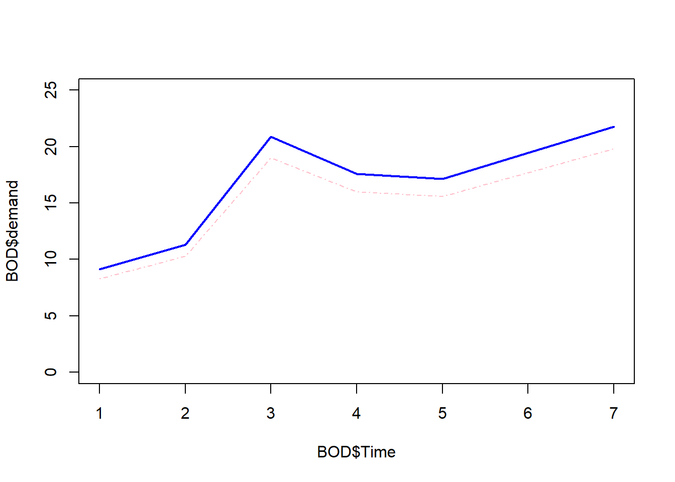
Use R to do the following exercises on the chickwts data.
Display the built-in chickwts data.
chickwts weight feed
1 179 horsebean
2 160 horsebean
3 136 horsebean
4 227 horsebean
5 217 horsebean
6 168 horsebean
7 108 horsebean
8 124 horsebean
9 143 horsebean
10 140 horsebean
11 309 linseed
12 229 linseed
13 181 linseed
14 141 linseed
15 260 linseed
16 203 linseed
17 148 linseed
18 169 linseed
19 213 linseed
20 257 linseed
21 244 linseed
22 271 linseed
23 243 soybean
24 230 soybean
25 248 soybean
26 327 soybean
27 329 soybean
28 250 soybean
29 193 soybean
30 271 soybean
31 316 soybean
32 267 soybean
33 199 soybean
34 171 soybean
35 158 soybean
36 248 soybean
37 423 sunflower
38 340 sunflower
39 392 sunflower
40 339 sunflower
41 341 sunflower
42 226 sunflower
43 320 sunflower
44 295 sunflower
45 334 sunflower
46 322 sunflower
47 297 sunflower
48 318 sunflower
49 325 meatmeal
50 257 meatmeal
51 303 meatmeal
52 315 meatmeal
53 380 meatmeal
54 153 meatmeal
55 263 meatmeal
56 242 meatmeal
57 206 meatmeal
58 344 meatmeal
59 258 meatmeal
60 368 casein
61 390 casein
62 379 casein
63 260 casein
64 404 casein
65 318 casein
66 352 casein
67 359 casein
68 216 casein
69 222 casein
70 283 casein
71 332 caseinWhat are the names of chickwts? Use a function other than str
names(chickwts)[1] "weight" "feed" What are the levels of feed?
levels(chickwts$feed)[1] "casein" "horsebean" "linseed" "meatmeal" "soybean" "sunflower"Make the following plots in one 2 x 2 image: - A bar chart of the feed types, each bar a different color. - A bar chart of the proportions of feed types, each bar a different color. - A boxplot of the weights by feed type, each box a different color. - A horizontal boxplot of the weights by feed type, each box a different color.
par(mfrow = c(2, 2))

barplot(table(chickwts$feed),
  col = c("red", "orange", "yellow",
  "green", "blue", "purple"))

barplot(table(chickwts$feed)/length(chickwts$feed),
  col = c("red", "orange", "yellow",
  "green", "blue", "purple"))

boxplot(chickwts$weight~chickwts$feed,
  col = c("red", "orange", "yellow",
  "green", "blue", "purple"))

boxplot(chickwts$weight~chickwts$feed,
  col = c("red", "orange", "yellow",
  "green", "blue", "purple"),
  horizontal = TRUE)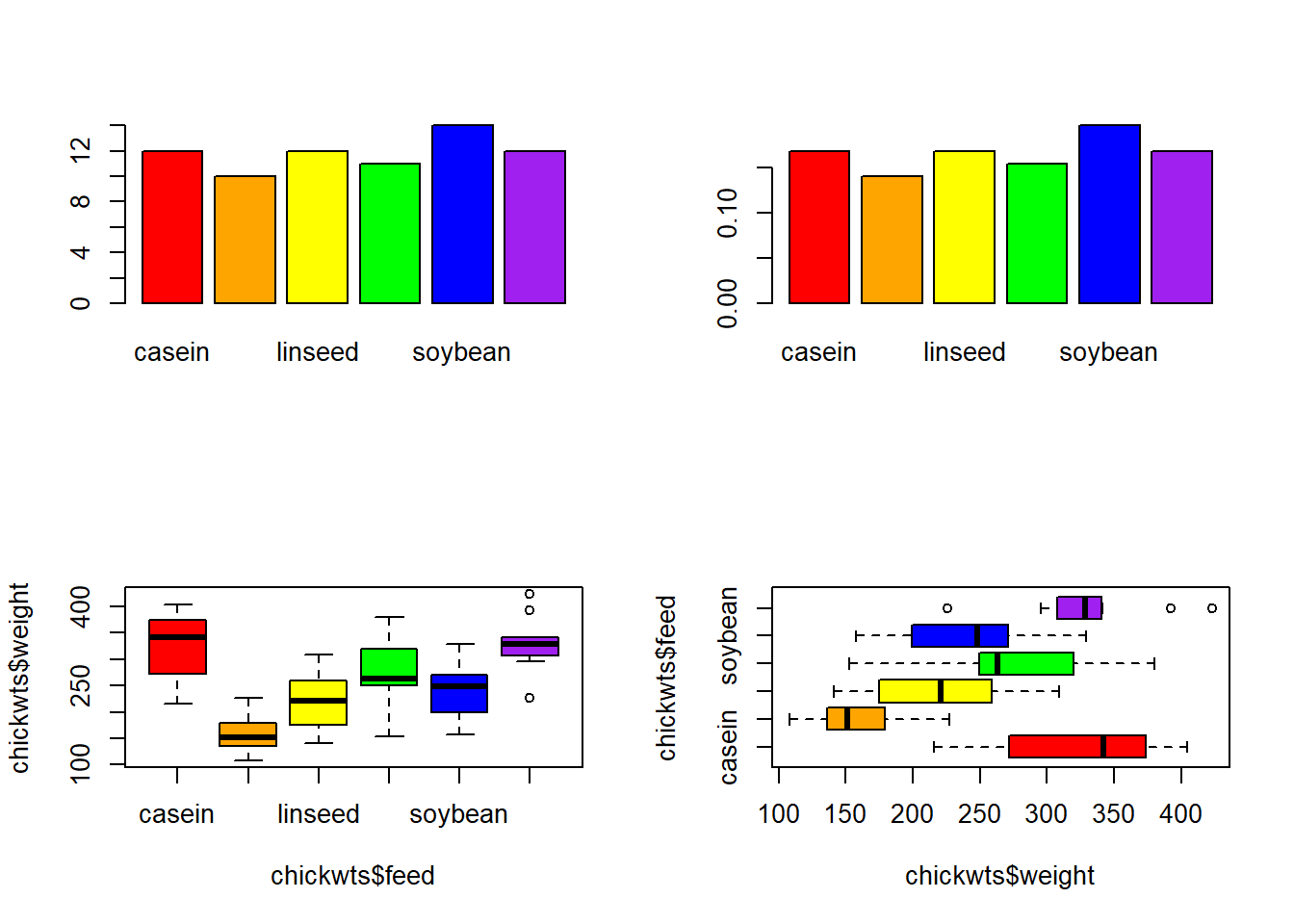
Use R to do the following exercises on the Puromycin data.
Display the built-in Puromycin data.
Puromycin conc rate state
1 0.02 76 treated
2 0.02 47 treated
3 0.06 97 treated
4 0.06 107 treated
5 0.11 123 treated
6 0.11 139 treated
7 0.22 159 treated
8 0.22 152 treated
9 0.56 191 treated
10 0.56 201 treated
11 1.10 207 treated
12 1.10 200 treated
13 0.02 67 untreated
14 0.02 51 untreated
15 0.06 84 untreated
16 0.06 86 untreated
17 0.11 98 untreated
18 0.11 115 untreated
19 0.22 131 untreated
20 0.22 124 untreated
21 0.56 144 untreated
22 0.56 158 untreated
23 1.10 160 untreatedMake a scatterplot of the rate versus the concentration. Describe the relationship.
plot(Puromycin$conc, Puromycin$rate)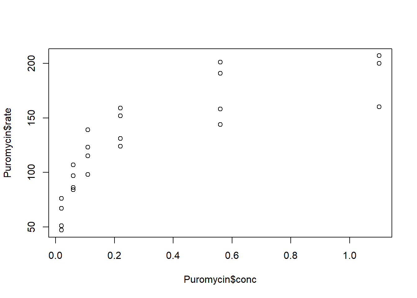
The rate increases faster at lower concentrations than at higher concentrations.
Make a scatterplot of the rate versus the log of the concentration. Describe the relationship.
plot(log(Puromycin$conc), Puromycin$rate)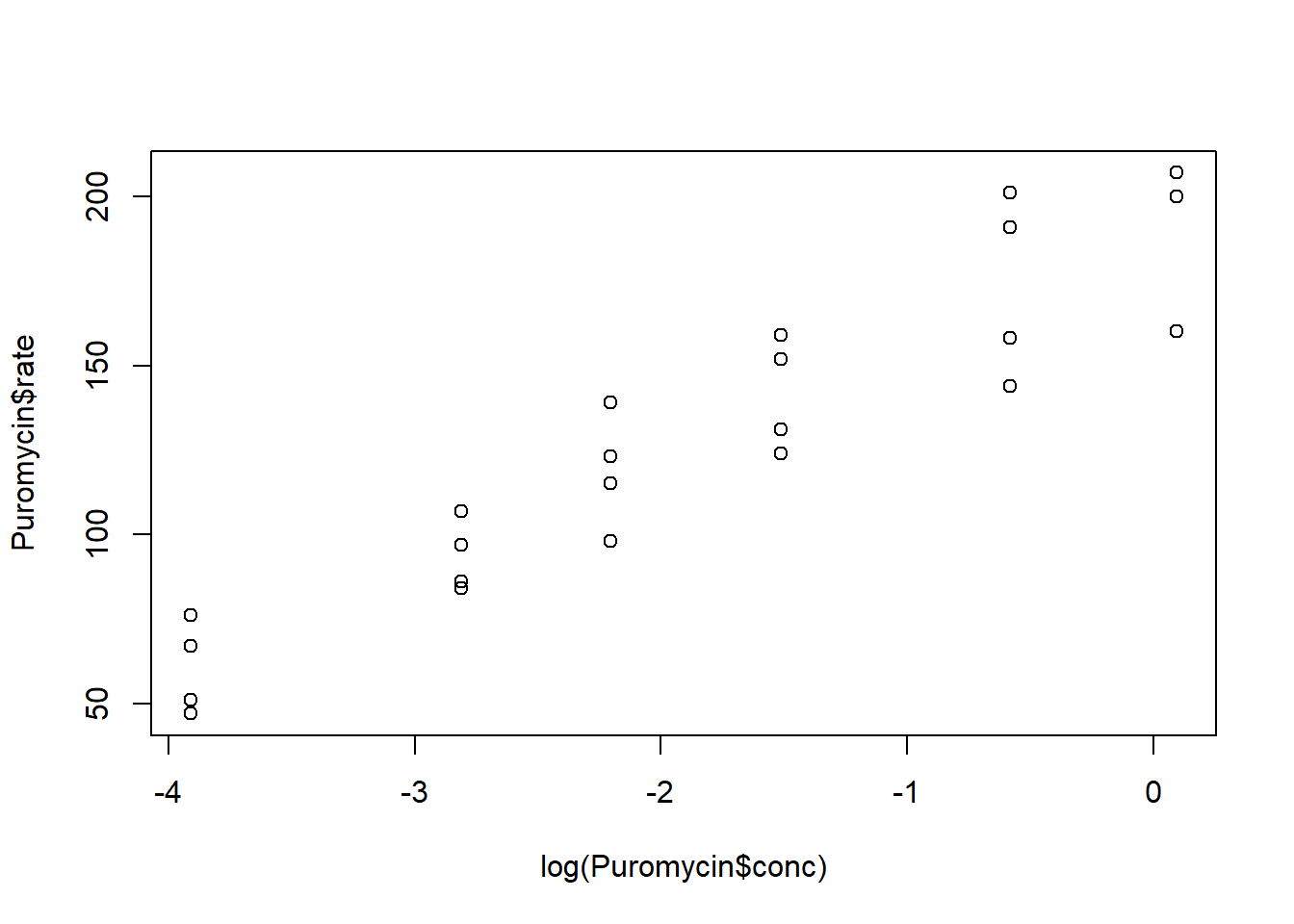
The two variables have a linear relationship
Make a scatterplot of the rate versus the log of the concentration and color the points by treatment group (state). Describe what you see.
plot(log(Puromycin$conc), Puromycin$rate, col = Puromycin$state)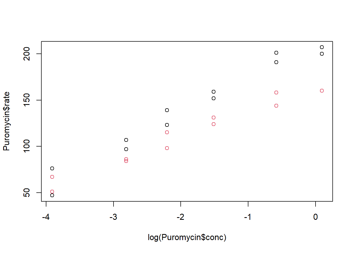
It appears that the the treated group has higher rates than the untreated group, on average. (Note that default colors are black for the first level and red for the second level).
Make a scatterplot of the rate versus the log of the concentration, color the points by treatment group (state), label the x-axis “Concentration” and the y-axis “Rate”, and label the plot “Puromycin”.
plot(log(Puromycin$conc), Puromycin$rate, col = Puromycin$state,
  xlab = "Concentration", ylab = "Rate", main = "Puromycin")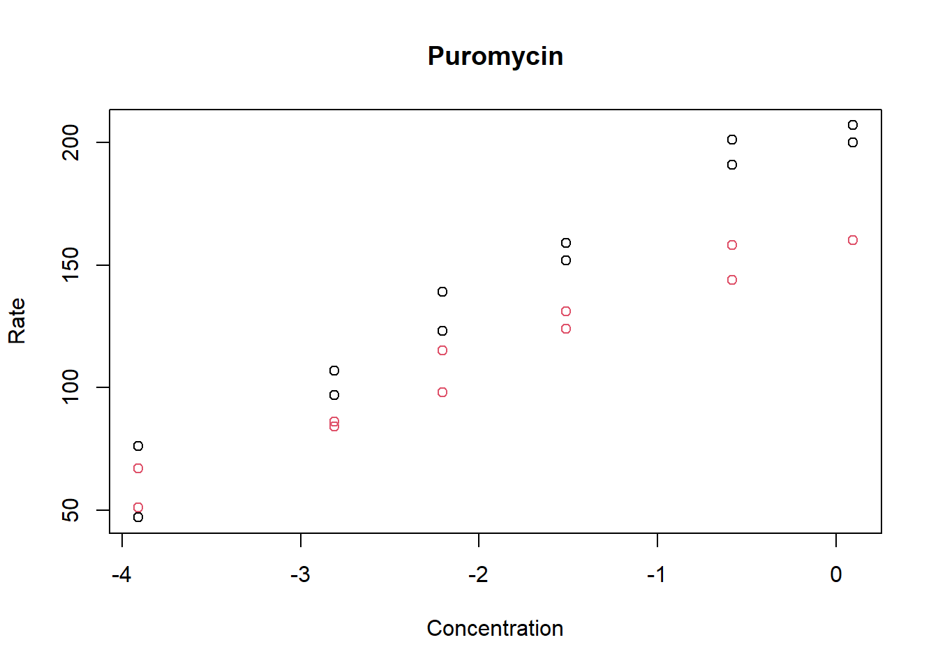
Add a legend to the above plot indicating what the points represent.
plot(log(Puromycin$conc), Puromycin$rate, col = Puromycin$state,
  xlab = "Concentration", ylab = "Rate", main = "Puromycin")

legend("topleft",c("Treated", "Untreated"), col = 1:2, pch = 1)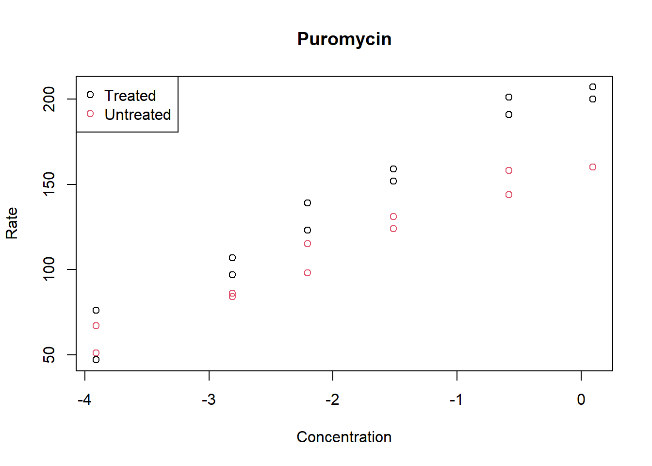
Make a boxplot of the treated versus untreated rates. Using the function pdf, save the image to a file with a width and height of 7 inches.
pdf("puromycin.pdf",width = 7, height = 7)
boxplot(Puromycin$rate~Puromycin$state)
dev.off()Make a histogram of the frequency of concentrations. What is the width of the bins?
hist(Puromycin$conc)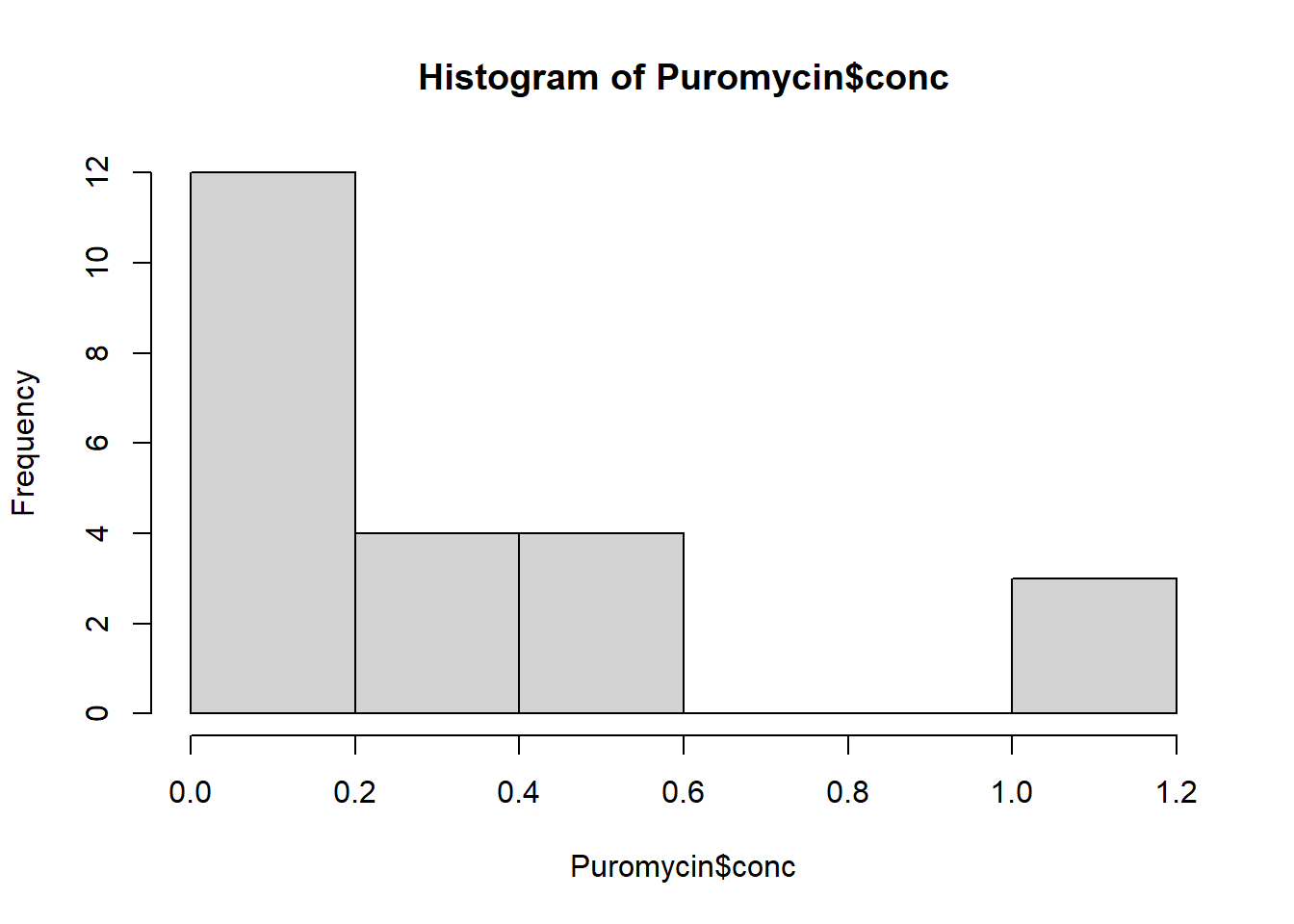
The bin width is 0.20.
Make a histogram of the frequency of concentrations with a bin width of 0.10. How is this different from the histogram above?
hist(Puromycin$conc, breaks = seq(0, 1.2, .10))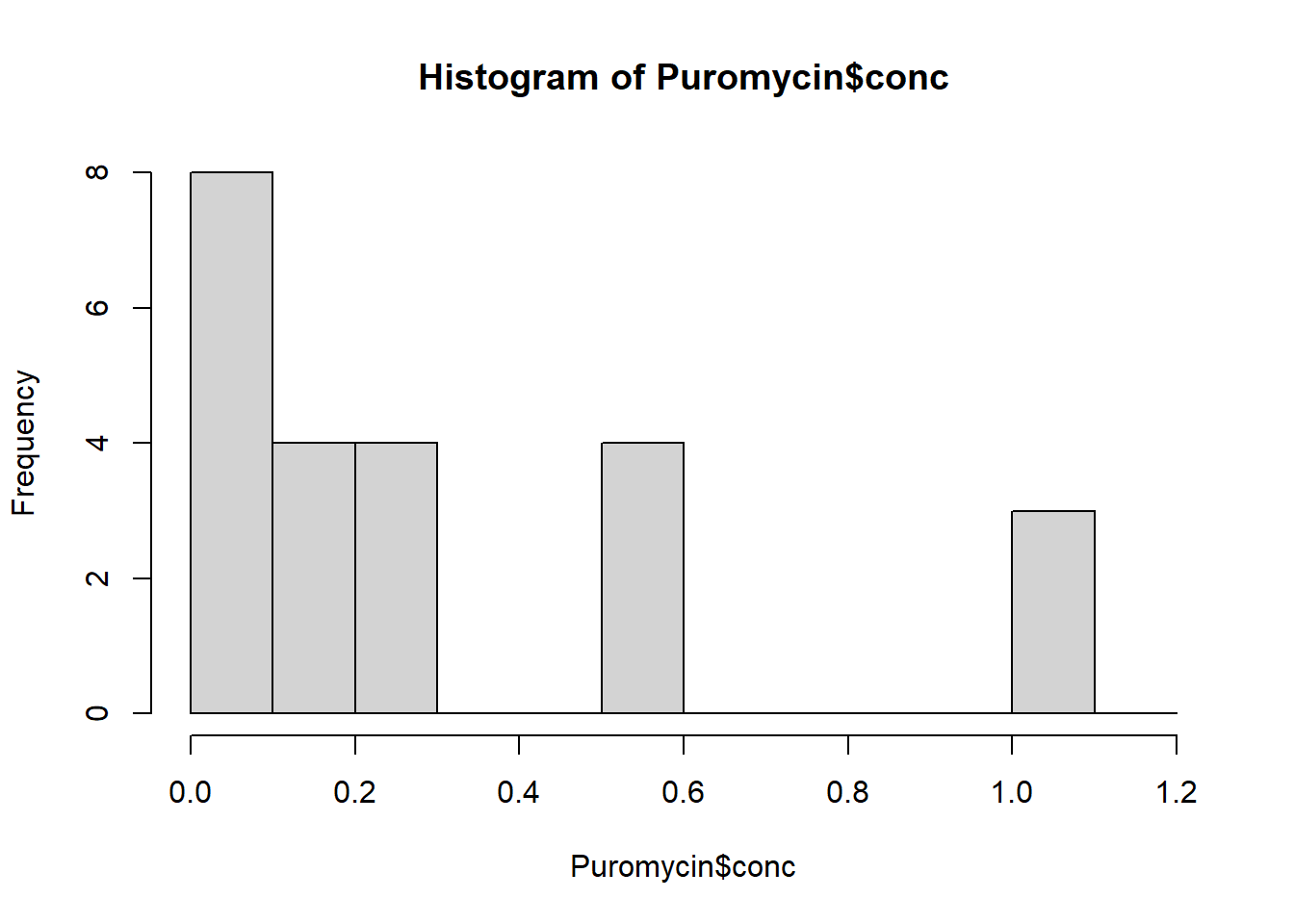
The bins are narrower, so we see in finer detail the distribution of the concentrations.
Plot the histograms side by side in the same graphic window and make sure they have the same range on the y-axis. Does this make it easier to answer the question of how the two histograms differ?
par(mfrow = c(1, 2))
hist(Puromycin$conc, ylim = c(0, 12))
hist(Puromycin$conc, breaks = seq(0, 1.2, .10), ylim = c(0, 12))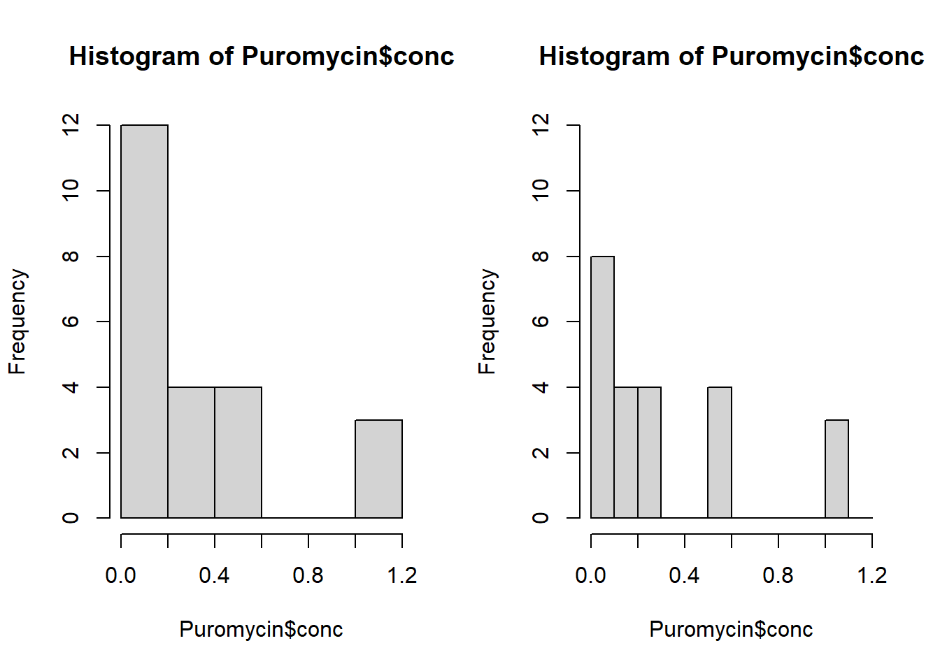
In some situations it may be of use to view plots simultaneously. In this case, on the right we see clearly that more values are between 0 and 0.10 than 0.10 and 0.20 whereas the plot on the left does not display this information. In the histogram on the right we see that no concentrations fall between 0.30 and 0.50, whereas this is not apparent in the histogram on the left.